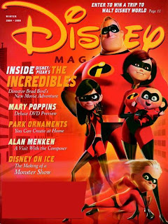
 This is a cover of Disney's Magazine of Winter 2004-2005. It is obviously promoting its next best film and to show its dominance the picture of the characters are over the text of the masthead, also furtherly showing that disney is so confident in its brand that some of the title can be covered and still people will recognise it. Target audience for the magazine is for children as it shows the promotion of a family film, represented by 'The Incredibles' on the cover. This proves that the film and the magazine is friendly and suitable for all ages. From the use of red, a simple colour stereotypically related to males, gives the impression that 'The Incredibles' will appeal more to males, also superhero type films are always related back to well known male heroes for example 'Spiderman', 'Superman', 'Batman' etc, although having the older sister on display, shows a character females could also relate to, saying that girls could like it just as much as the boys, it is a film aimed at a wide target audience. Also having the use of orange and yellow on the cover displays a further appeal to a female audience, as stereotypically females will be attracted to more complex colours. For my own front cover, I could lay it out the way that this magazine has, putting a bold picture of my characters on the front to help promote my new children's TV drama, making sure I use colours that will appeal to my target audience and that my subheadings will also attract and target the same audience I want watching my children's TV drama.
Thursday, 13 August 2009
Disney Magazine Cover.
 This is a cover of Disney's Magazine of Winter 2004-2005. It is obviously promoting its next best film and to show its dominance the picture of the characters are over the text of the masthead, also furtherly showing that disney is so confident in its brand that some of the title can be covered and still people will recognise it. Target audience for the magazine is for children as it shows the promotion of a family film, represented by 'The Incredibles' on the cover. This proves that the film and the magazine is friendly and suitable for all ages. From the use of red, a simple colour stereotypically related to males, gives the impression that 'The Incredibles' will appeal more to males, also superhero type films are always related back to well known male heroes for example 'Spiderman', 'Superman', 'Batman' etc, although having the older sister on display, shows a character females could also relate to, saying that girls could like it just as much as the boys, it is a film aimed at a wide target audience. Also having the use of orange and yellow on the cover displays a further appeal to a female audience, as stereotypically females will be attracted to more complex colours. For my own front cover, I could lay it out the way that this magazine has, putting a bold picture of my characters on the front to help promote my new children's TV drama, making sure I use colours that will appeal to my target audience and that my subheadings will also attract and target the same audience I want watching my children's TV drama.
Subscribe to:
Comments (Atom)
